

If you are interested in a top-down analysis of sectors then you may find the attached workbooks for both the Australian and US markets useful. Each tab in the workbook contains the current members of the sector (updated following the recent quarterly rebalancing), and includes examples of watchlists, charts (such as seasonality and relative comparison charts), and indicators (eg drawdown, and pivot labels). They also include a new 6 month high / low scan, with the Australian workbook also including the members of the ASX All Tech Index ($XTX).
The first page is a sector overview, which includes a watchlist of the sector performance along with a weekly Relative Rotation Graph® and weekly candlestick chart (click on any symbol in the watchlist to change the chart).
[Image: ASX Overview]{:class="center"} ASX Overview
If you find a particular layout useful remember that you can save it as a Page Layout and apply it to your own charts (delete the watchlist first if you only want the Page Layout to include the chart).
For more information on Page Layouts click here.
Here's an example of the ASX IT sector, which includes a daily chart with a three bar Gann Swing Overlay, and year-to-date performance against the IT sector index ($XIJ). If you have ASX Fundamental Data on your account you will also see the Market Cap column in the watchlist:
[Image: ASX IT]{:class="center"} ASX IT
Here's a screenshot of the Relative Strength Ratios tab from the ASX workbook. This automatically displays a chart relative to the ASX200 Index $XJO using the Relative Index property. As you scroll down the chart will update without the need to create a custom code or Division Spread chart.
The Show View below the chart shows the performance against the index over the last quarter.
[Image: ASX Relative Strength Ratios]{:class="center"} ASX Relative Strength Ratios
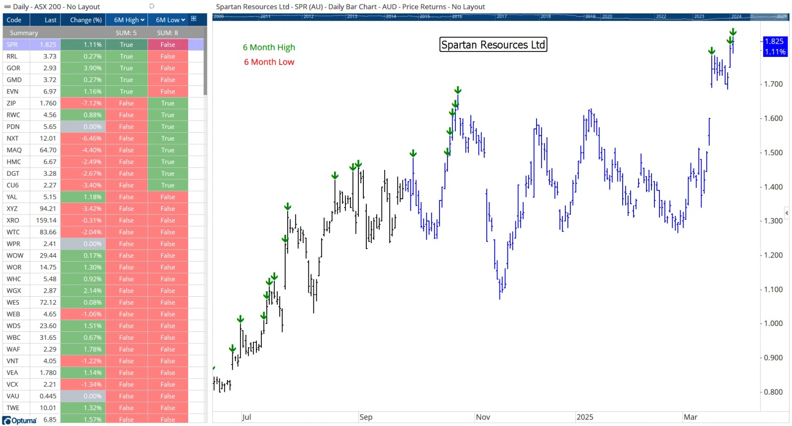
This last example shows a watchlist of the ASX 200 companies with a true/false column for new 6 month highs and another for 6 month lows (right-click on the column headings and select Edit Column to see the underlying script formulas). At time of writing there were 10 new highs and 4 new lows on that particular day. The chart on the right highlights the new 6 month highs and lows with a Show Bar arrow, with the last 6 months highlighted in blue using a custom bar colour scheme:
Optuma clients can click the buttons below to save the workbook files, and once saved - usually to your Downloads folder - double-click on the file to open. When prompted to move them from the download location to your default Workbooks folder click yes.
Please contact us if you have any questions.

Senior Software Specialist at Optuma
Darren is the senior Software Specialist at Optuma based in Brisbane, Australia. Darren grew up in the UK and attended college in the USA where he earned a BA in Economics from St Mary's College of Maryland. He went on to spend a few years working at the Nasdaq Stock Market in Washington DC. Darren joined Optuma in 2009 after attending an introductory technical analysis course that used the software.


