

Read Part 1 | A Brief History of the Development of Median Line Analysis – A.K.A. Andrews’ Pitchfork
Read Part 2 | Andrews’ Pitchfork: Application and Analytical Methods Using Median Line Analysis
Price action creates a mathematical grid that, when brought to light, can be used to identify targets, as well as support and resistance levels. The grid becomes visible through independent analysis of three axes: horizontal (price), vertical (time) and diagonal (price and time). The goal of this article is to discuss a few of the techniques found to be invaluable in analyzing the diagonal axis using the Andrews' Pitchfork tool in Optuma. The other individual axes, vertical and horizontal, will not be discussed.
Analyzing the diagonal axis is traditionally accomplished with trend lines. Two points of contact is the minimum requirement to draw a valid trend line. Pitchforks are unique in that they require three points of contact. The importance of this fact cannot be overstated. Three points of contact allows a pitchfork to triangulate the price/time grid unlike any other tool. And, for those technicians who have ventured into the Gann “rabbit hole”, there are no discussions of hidden factors or scaling charts. In fact, Gann students should consider the implications of our method of diagonal discovery (see Combination Pitchforks) and its use as an alternative, mechanical method for “reverse engineering” a chart’s factor.
A few additional points:
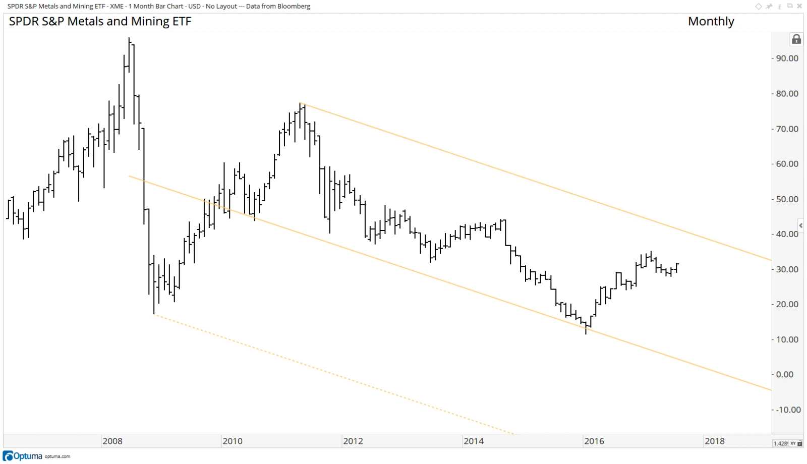
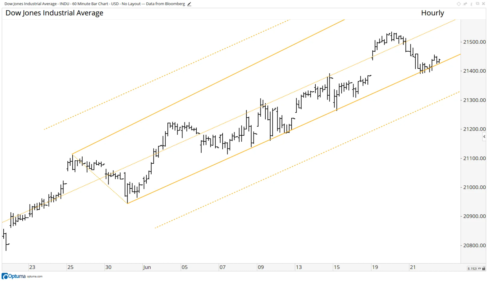
Before we continue we would like mention three points. Firstly, median line analysis can be used in all time frames. The monthly chart of the S&P Metals and Mining ETF (XME) and the hourly chart of the Dow Jones Industrial Average (INDU) serve well as examples.
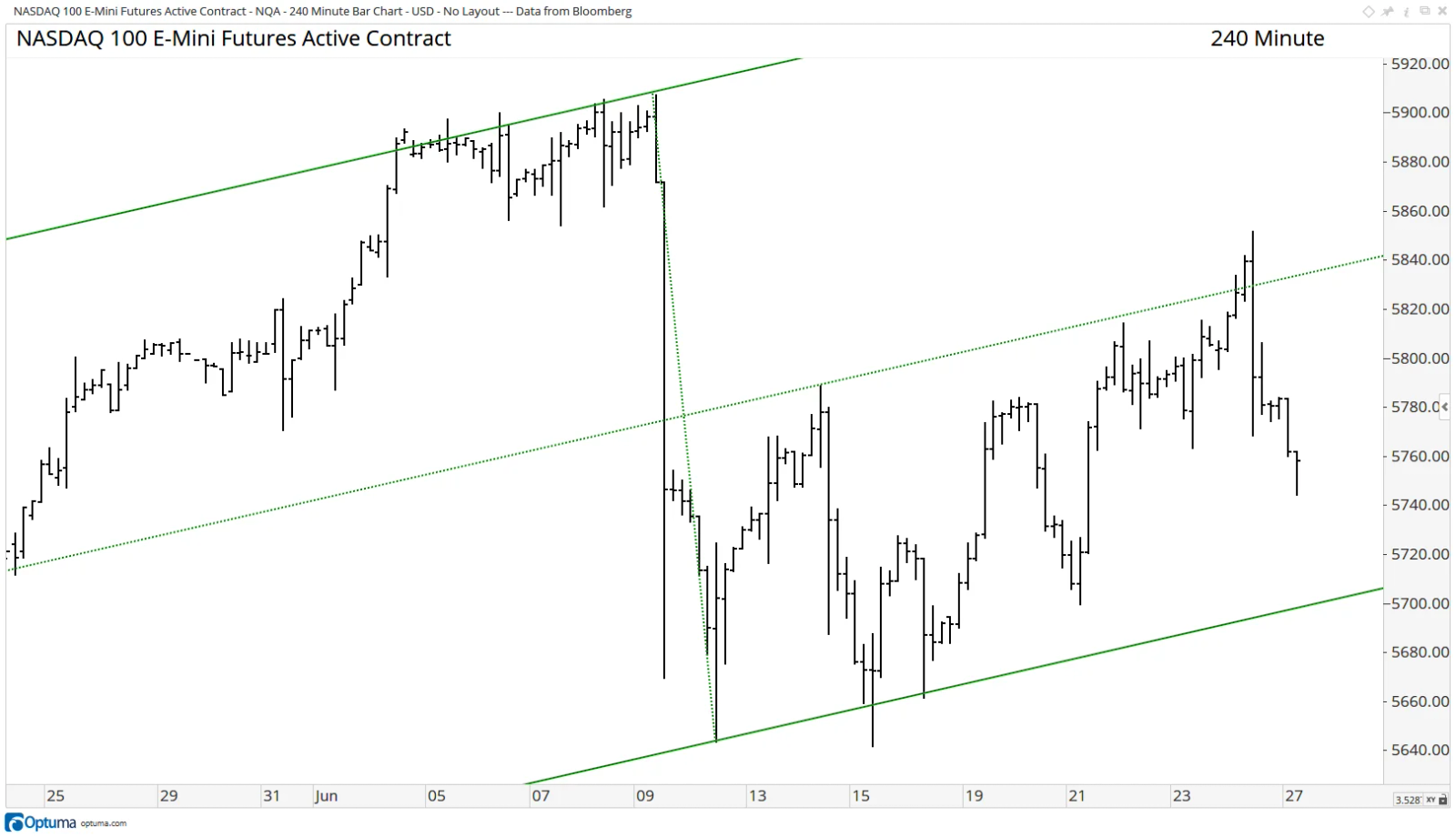
Secondly, minor violations of support on an intra-period basis, as well as on a closing basis, do not reduce the veracity of the indicator (note chart of the NASDAQ 100 E-Mini Future below). Only when price runs past with conviction, or “lingers’” in a state of violation, does it suggest that there has been a technical change of the angle in the price/time grid.
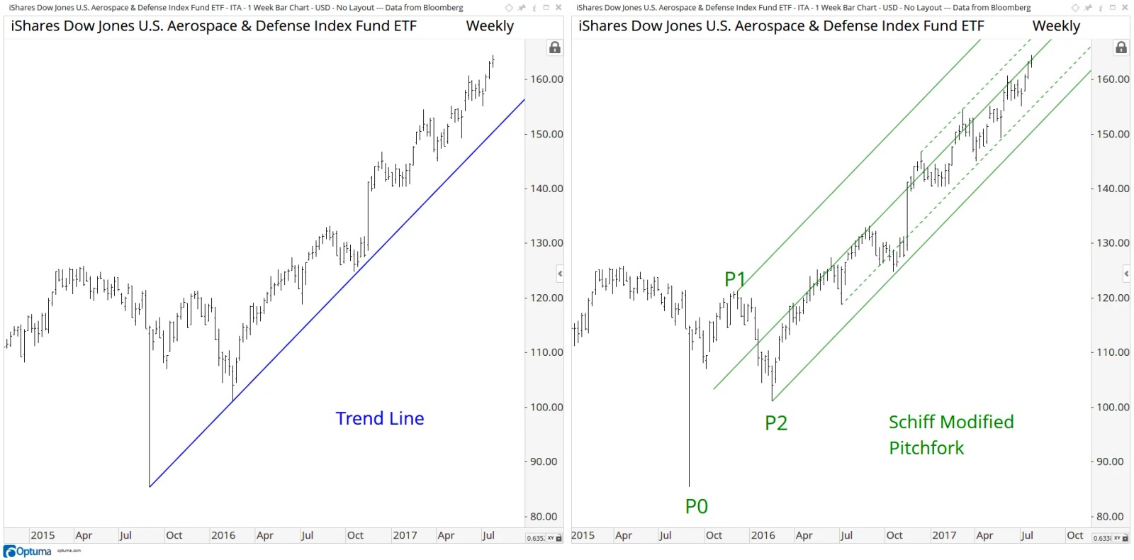
Thirdly, and most importantly, in most cases median line/pitchfork analysis is a superior analytical tool when compared to traditional trend line methods, as it gives the chartist far more technical data points to consider during his or her analysis. Reflect on the differences between the weekly charts of the US Aerospace & Defense ETF (ITA) below.
Click here to learn how Schiff and Schiff Modified pitchforks are created.
Combination Pitchforks
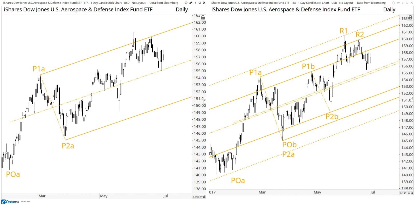
The first example of our analytical method of diagonal discovery is by using what we refer to as “Combination Pitchforks”. In the left panel below we have applied a Schiff adjusted pitchfork (labeled “<font color='#ffcc00;'>a</font>”) to the daily chart of the US Aerospace & Defense ETF (ITA) using three pivots; the low at <font color='#ffcc00;'>POa</font>, to the high at <font color='#ffcc00;'>P1a</font>, and higher low at <font color='#ffcc00;'>P2a</font>. The panel to the right adds a second Schiff adjusted pitchfork (labeled “<font color='#ffcc00;'>b</font>”) utilizing the three pivots that follow; drawn once again from a low at <font color='#ffcc00;'>POb</font>, to the high at <font color='#ffcc00;'>P1b</font>, and then to the low at <font color='#ffcc00;'>P2b</font>. Dashed warning lines are then added outside pitchfork “<font color='#ffcc00;'>b</font>”. The reversal at the upper warning line of the second pitchfork at <font color='#ffcc00;'>R1</font> and reversal two and a half weeks later at the upper parallel at <font color='#ffcc00;'>R2</font> indicates we have identified the correct price/time grid. Now observe that both pitchforks, drawn from different pivots, are forming the exact same angle. This is confirmation that we have discovered the dominant frequency within this market’s price/time grid. Going forward, an analyst can continue to utilize this frequency. How so? See below.
Dueling Pitchforks
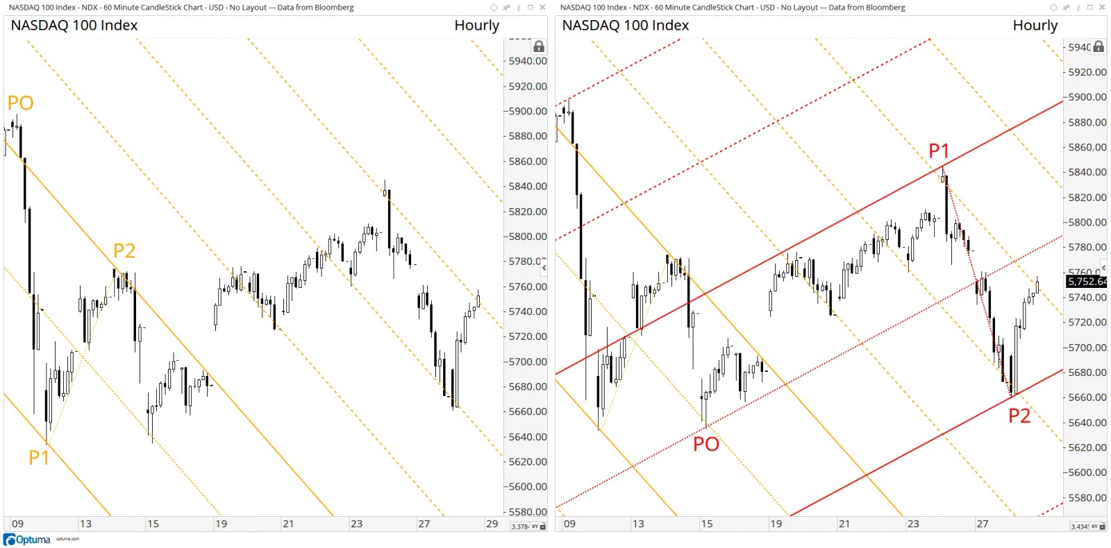
Upon confirmation of a market’s dominant frequencies, a technician can take his or her analysis one step further by employing what we refer to as “Dueling Pitchforks”. This technique utilizes two pitchforks (one bearish, one bullish) to form the price/time grid. In the panel below left we have drawn a Schiff adjusted pitchfork on an hourly NASDAQ 100 Index chart from the high at <font color='#ffcc00;'>PO</font>, to the low at <font color='#ffcc00;'>P1</font>, then to the lower high at <font color='#ffcc00;'>P2</font>. We then have added multiple warning lines. Note these warning lines have been respected by price. On the panel to the right we have added a standard pitchfork to the same chart starting from the low at <font color='red'>PO</font>, to the high at <font color='red'>P1</font>, then to the higher low pivot point <font color='red'>P2</font>, and similarly, have added multiple warning lines. These two pitchforks, working from a bear and bull perspective, work to reveal the price/time grid acting as diagonal resistance and support.
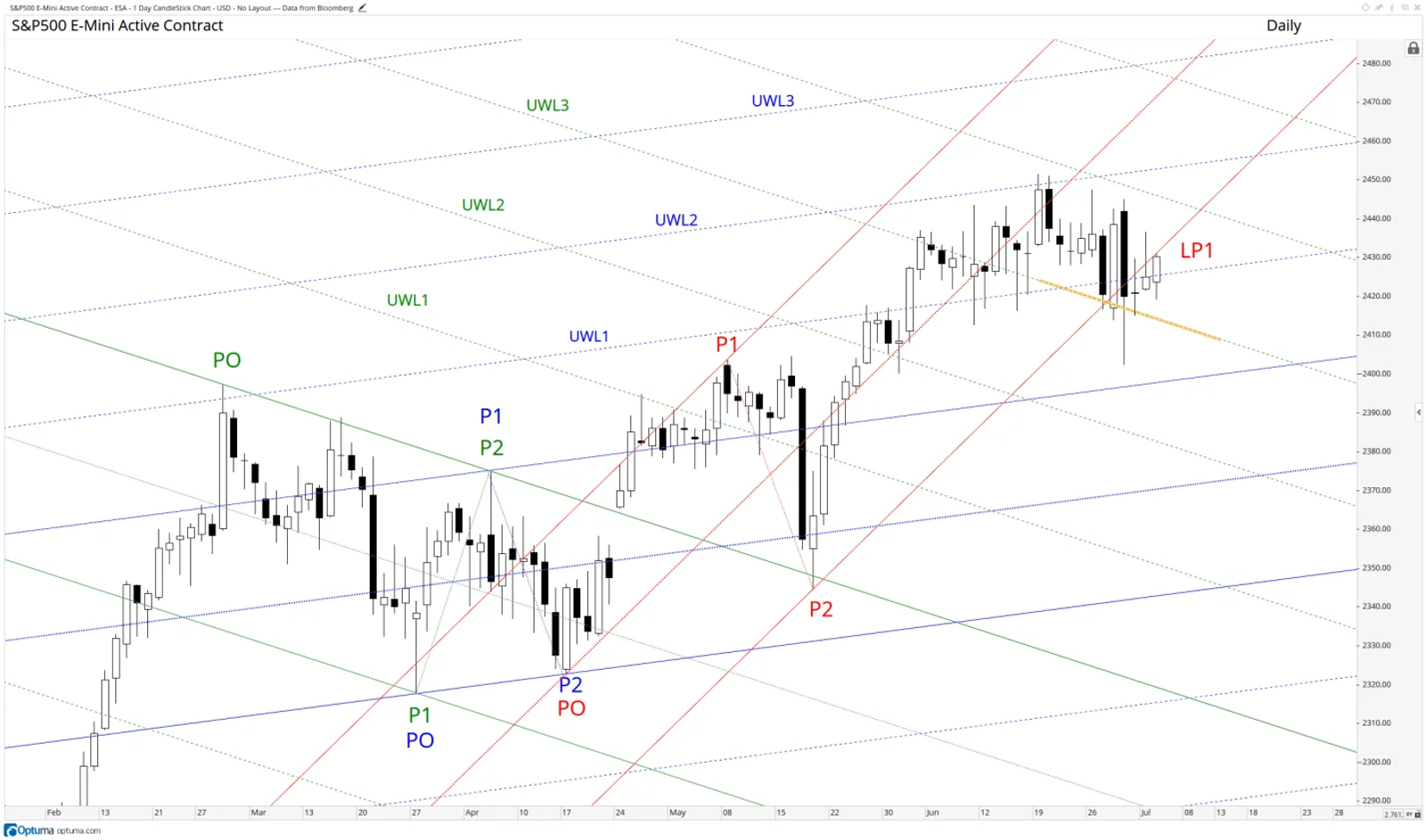
The chart below of the daily S&P E-Mini Active Contract serves as another example of Dueling Pitchforks, but utilizes three pitchforks to create the price/time grid. The first pitchfork is a bearish Schiff modified drawn from the late February high at <font color='#008000;'>PO</font>, down to the April low <font color='#008000;'>P1</font> and up to the lower high at <font color='#008000;'>P2</font>. The second originates at the same April swing low at <font color='blue'>PO</font> and is drawn up to the swing high at <font color='blue'>P1</font>, and terminates at <font color='blue'>P2</font>. This is also Schiff modified, and for clarity purposes we have color coded it blue. The third is a standard pitchfork (in red) drawn from the next swing low <font color='red'>PO</font>, to a higher high <font color='red'>P1</font> and then down to a higher low <font color='red'>P2</font>. This completes the grid.
Recent price action suggests that the price/time grid is beginning to change. This is revealed in the following data points: Price has violated support at the upper warning line, <font color='blue'>UWL1</font>, and support at the lower parallel <font color='red'>LP1</font> has flipped to resistance. Both of these developments suggest that the “price unit” or leg up since <font color='red'>PO</font> may have reached its terminus. What would be the appropriate next step in this analysis given the violation? Add warning lines to the standard pitchfork in red.
Confluence and Multiple Time Frame Momentum
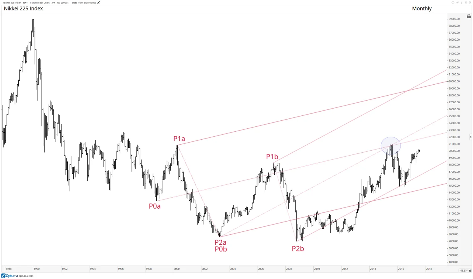
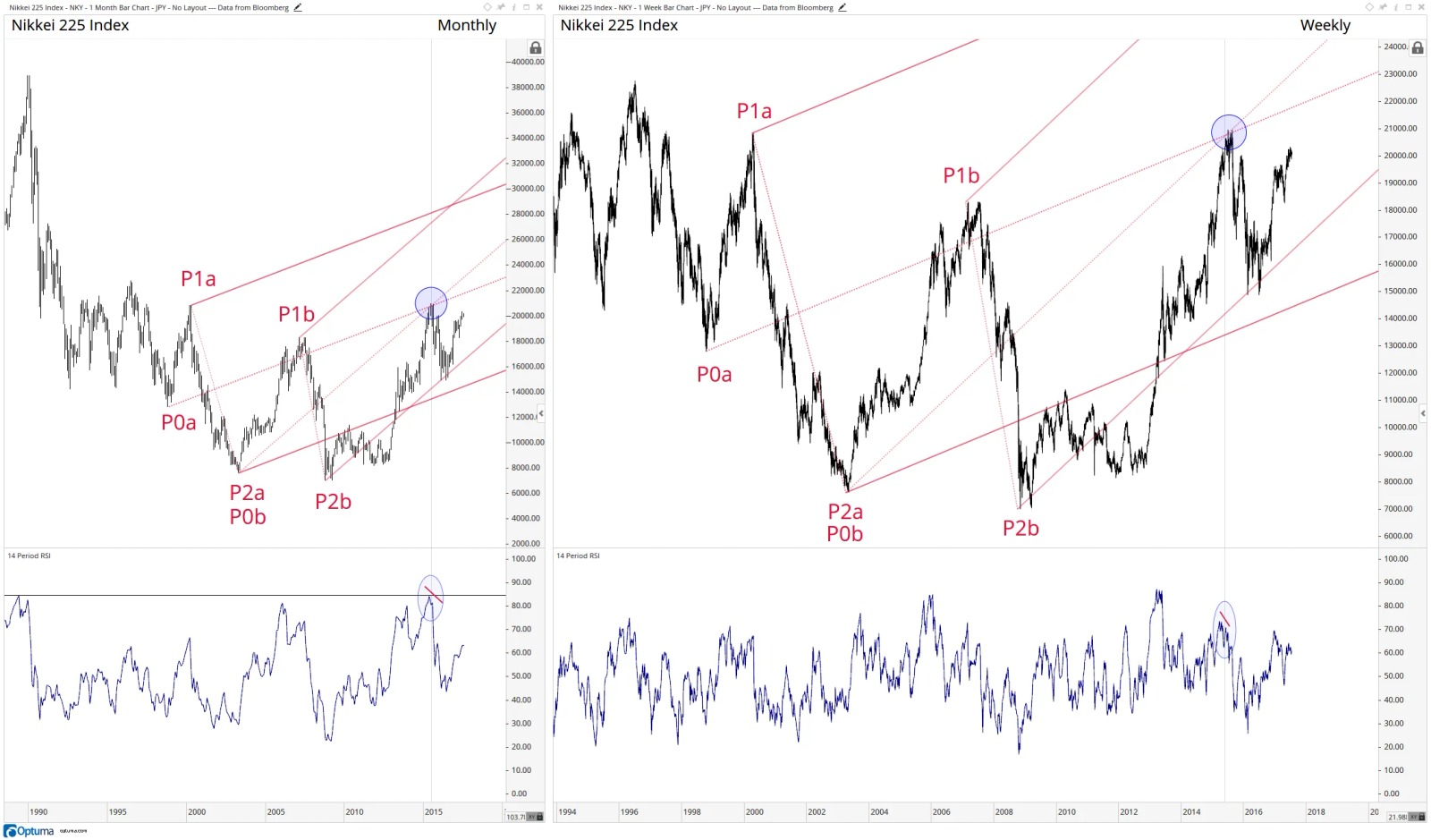
The idea of confluence is fundamental to technical analysis. Confluence can be defined as a zone composed of more than one level of support, resistance or targets that work to strengthen a specific point on the price/time grid. An excellent example of median line confluence is found in the monthly chart of the Nikkei225 presented below. Two standard pitchforks labeled <font color='red'>a</font> and <font color='red'>b</font> have been drawn from consecutive pivots. Observe that price developed a significant swing high at a confluence of resistance composed of both median lines (blue circle).
How could an analyst have had even more confidence that price would react to this confluence zone? The answer lies in multiple time frame momentum analysis. Examine the next series of charts.
Below left is the previous monthly chart of the Nikkei225 with the addition of a 14-period Relative Strength Index (RSI). Below right is the exact same chart transferred to a weekly timeframe. A vertical line has been drawn on each chart to identify the momentum oscillator signal developing at the point where the median lines cross. Study the monthly chart. The oscillator is producing a tight bearish divergence sell signal at the all-time maximum horizontal displacement level. For those who need a refresher, a bearish divergence occurs when a momentum oscillator creates a lower high as price coincidently makes a higher high. Now examine the weekly chart. Note that weekly momentum is also printing a series of bearish divergences as price tests both median lines. Sell signals developing in multiple time frames as price test median line confluence resistance is a high confidence signal for a reactionary pullback.
The Devil is in the Details (Real-Time Walkthrough)
The next two examples of pitchfork analysis will be walked through in detail as if the analysis were taking place in real-time. At times the discourse may seem tedious, but for the sake of analytical explanation we ask for our reader’s patience.
Shifts Within the Range of a Single Pitchfork
Below is a daily chart of the SPDR Energy Select Sector ETF (XLE) displaying a Schiff adjusted pitchfork drawn from <font color='#ffcc00;'>P0</font>, <font color='#ffcc00;'>P1</font> and <font color='#ffcc00;'>P2</font>. A quick look tells us that the XLE is in a downtrend, but a more detailed examination provides insight into the underlying supply/demand dynamics of the market. Our consideration of the progression of price as it tracks lower within the confines of the pitchfork’s warning lines is yet another example where utilizing pitchforks in place of simple trend lines offers a more complete picture.
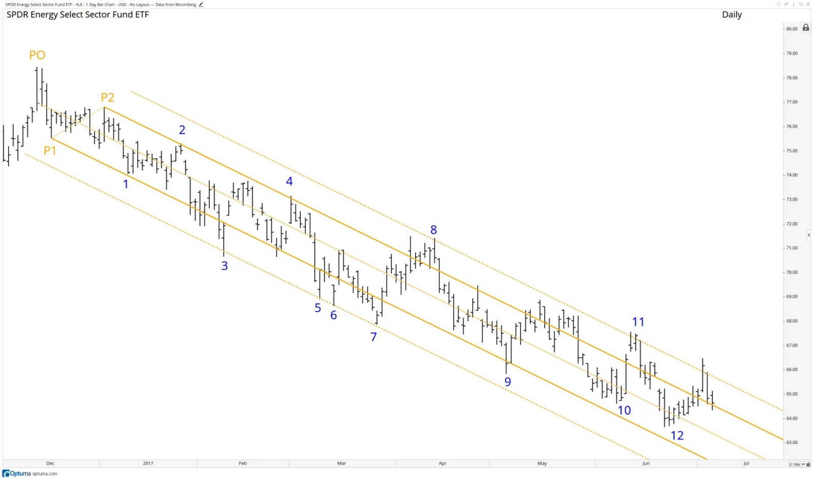
The pivots at point <font color='blue'>1</font> and <font color='blue'>2</font> are confined by the upper and lower parallel lines and help to confirm the Schiff adjusted pitchfork is displaying the dominant frequency. Next, hints of an accelerated decline are revealed with a repeated intraday violation of the lower parallel in the days leading up to pivot <font color='blue'>3</font>, which finds support and bounces at the lower warning line. XLE is once again unable to trade above the upper parallel at pivot <font color='blue'>4</font>, indicating the downtrend remains in force. Repeated touches of the lower warning line at <font color='blue'>5</font>, <font color='blue'>6</font>, and <font color='blue'>7</font> reinforce the bottom of the channel and reaffirm the downtrend. Pivot <font color='blue'>8</font> is a subtle clue that the power of the decline is diminishing as prices reach the upper warning line for the first time. At pivot <font color='blue'>9</font>, prices hold the lower parallel of the pitchfork at the close and, for several days leading to pivot <font color='blue'>10</font>, prices fail to reach the lower parallel line (two more signs of waning selling pressure). XLE closes above the upper parallel for the first time at pivot <font color='blue'>11</font>, and once again at pivot <font color='blue'>12</font>, it fails to reach the lower parallel line.
In review, pivots <font color='blue'>1</font> through <font color='blue'>7</font> travel between the upper parallel and the lower warning line. Pivots <font color='blue'>8</font> through <font color='blue'>12</font> move between the upper warning line and the lower parallel. This subtle, but hugely important, shift within the pitchfork hints that the multi-month downtrend is likely in the early stages of a reversal. Once again, median line analysis provides the analyst with a level of depth that is not available through traditional trend line methodologies.
Slope of the Median Line
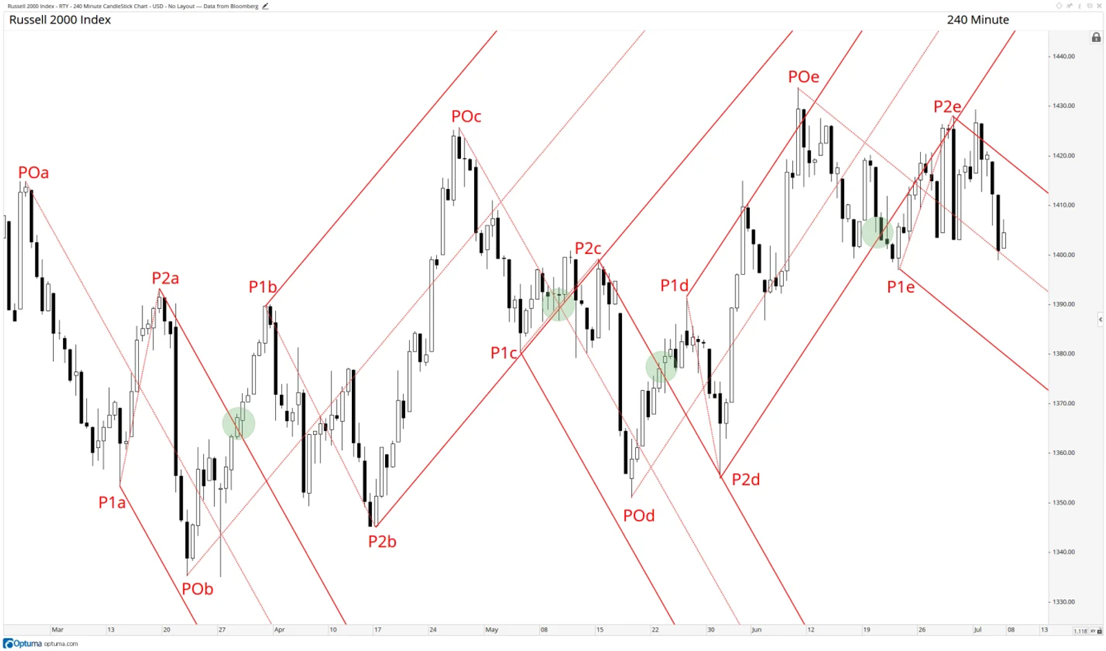
The next example provides another valuable perspective on the additional detail available to pitchfork users. The chart below is a 240-minute chart of the Russell 2000. There are five standard pitchforks marked with additional codification of <font color='red'>a</font> through to <font color='red'>e</font>. There are a number of technical observations that are offered on close inspection of chart. The first is when prices accelerate through the upper parallel of pitchfork <font color='red'>a</font> (noted by the first green circle). A conviction breakout of the pitchfork significantly raises the odds that the three-wave leg lower is complete and the E-Mini is due for a rally.
The next insight comes to light when we apply the second pitchfork at the pivot low at <font color='red'>POb</font>. Note that the swing line of the pitchfork <font color='red'>b</font> is at the same diagonal angle as the upper parallel of pitchfork <font color='red'>a</font>. This was the first confirmation of diagonal discovery of the price/time grid. Moving forward, price fails to reach the upper parallel of the second pitchfork at <font color='red'>POc</font>. The swiftness of the reversal, the piercing of the median line and the inability of price to retake the ground above are all clues that a three-wave rally had run its course. Price then begins to creep along the lower parallel of pitchfork <font color='red'>c</font> (second green circle) and then begins to violate support. The retest of the lower parallel from below at pivot <font color='red'>P2c</font> and subsequent acceleration lower necessitates the drawing of the third pitchfork labeled <font color='red'>c</font>. Note pitchfork <font color='red'>c</font> follows the same angle, or frequency, as pitchfork <font color='#ffcc00;'>a</font>, further confirming that the price/time grid is correct. Prices fail to reach the lower parallel and then reverse higher above the median line and resistance at the upper parallel (third green circle). Also note the breakout of pitchfork <font color='red'>c</font> significantly raises the odds of a completed three wave decline. Price then pulls back and finds support at the upper parallel of pitchfork <font color='red'>c</font>. We then draw the fourth pitchfork labeled <font color='red'>d</font>. Note pitchfork <font color='red'>d</font> has a median line with a steeper slope than pitchfork <font color='#ffcc00;'>b</font>. This is a subtle, but significant, clue the market is getting stronger. Also, note the two penetrations of the upper parallel further hints that underlying weakness is waning. Upon violation of the lower parallel (fourth green circle), price does not accelerate lower but stabilizes. Pitchfork <font color='red'>e</font> is drawn when price begins to move outside the confines of pitchfork <font color='red'>d</font>. Note the slope of the median line of pitchfork <font color='red'>e</font> is not as steep as pitchforks <font color='#ffcc00;'>a</font> and <font color='red'>c</font>. This is additional evidence of growing strength within this market.
In review, the slope of multiple pitchforks work to 1) confirm the price/time grid and 2) qualitatively measure the internal strength or weakness within a market.
Final Thoughts
In conclusion, the Andrews’ Median Line, or pitchfork, is a powerful tool that works to reveal the diagonal axis functioning within all freely traded markets. We argue pitchforks are superior to traditional trend line methodologies and should be a coveted tool within every technician’s tool box. As discussed previously, Combination Pitchforks are implemented to confirm the dominant frequency within a market. Once confirmed, this frequency can be employed in many ways to help forecast future points of support and resistance. One method is to employ Dueling Pitchforks which highlight the price/time grid from multiple directions. Other techniques, such as Median Line confluence, can be used to identify strong points of support or resistance. When used in concert with multiple time frame momentum, the analyst can act with conviction due to non-correlated signals. Finally, the authors believe that the subtle details and shifts within the range of a pitchfork, as well as the slope of median lines reveal underlying supply/demand dynamics better than other price trend discovery tool.

Managing Director of Technical Research and Founder and Principal of The Market’s Compass LLC
Timothy Brackett is a technical analyst with 30+ years’ financial markets experience both on the sell and buy side. He continues to monitor portfolio positions and searches for investment ideas utilizing technical analysis at Marketfield Asset Management LLC.


